Following through from my post last week, this is the second installment in my behind the scenes series, where I take you through a real life shoot, giving you an idea of how the final client image is put together and what are the reasons for selecting a particular type of light or composition.
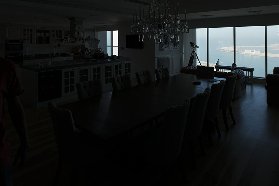
This week, it’s an interior shoot again, but an interior with a difference. I was working with LuxHabitat, a real estate agency based here in Dubai, which only deals with high-end properties in beautiful locations. As you can see from the shots below, this particular apartment has amazing views of the Palm Jumeirah and it was very important to be able to show these views in the final frame.
Like always, I started the shoot by getting the correct exposure for the outside, which is great for the view, but not so good for the rest of the living room and kitchen. Clearly, we had a lot of work in front of us, lighting the place up!
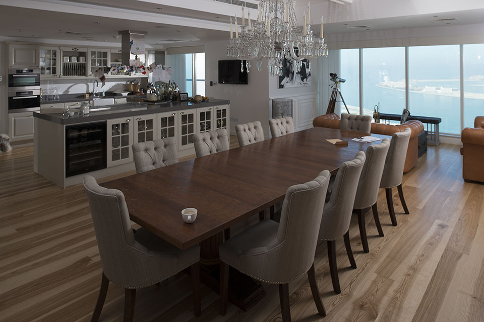
Composition wise, I settled for this angle, mostly because it was just about the only angle that showed the entire place and also included the view with the arch of the palm islands clearly visible and recognizable to anyone that’s been to Dubai.
The first step in the lighting process was to come up with a place for the main light, which was placed just outside of the frame at camera right. This was an SB-910, shot through an umbrella at about 45 degrees to the camera in order to somehow give you the impression that this light was coming from the outside. This light was also gelled with half a CTO to match it to the colour of the floor and to the colour of the light coming from the chandelier (in the image below, the chandelier is off, but for the final image it was turned on).
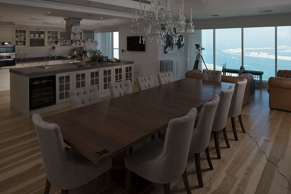
Those of you with a keen eye will notice that there’s also some additional light coming from the balcony. At this stage we were experimenting with pushing a lot of light from outside into the kitchen, but that idea didn’t really work as there were a few too many shadows to control.
After the failed light experiment on the balcony, we chose to place a small flash on the kitchen floor in order to separate the back counter from the front counter and just simply introduce more light into the kitchen. In the shot below, the flash is set quite low, but in the final shot, this was close to full power. One quick note here about flashes – when you’re photographing interiors and using small strobes, a lot of the times you’ll end up using these at close to full power, just so you can get close to f8 and have most of the room in focus.
That brings us to the final shot. Unfortunately I don’t have an in between image with the rest of the lights, but I can tell you that we ended up putting another light at the edge of the kitchen (camera left, just outside the frame, also shot through an umbrella). There is also a continuous light shining some light on the front of the kitchen counter to bring up slightly those shelves.
In terms of lens, this was taken with the 24mm tilt-shift lens and as you can see below, it’s taller than your normal 3:2 ratio a DSLR shoots. That’s because it has been stitched from two landscape images, which is a really easy thing to do when you’re shooting with a tilt-shift lens as your vertical lines do not move when you’re shifting the lens up and down.
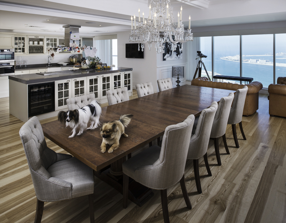
At this stage, a fair question would be: “Yeah, ok, enough about the light! What’s up with the dogs?”. Well, during the entire setup we had these two dogs who kept jumping up around us and I just loved the way they casually strolled on the table not bothered about anything around them. So I just had to include them in one of the final shots!
If you’ve got any questions about the setup or anything else in these images, the comments are below.
You might also like